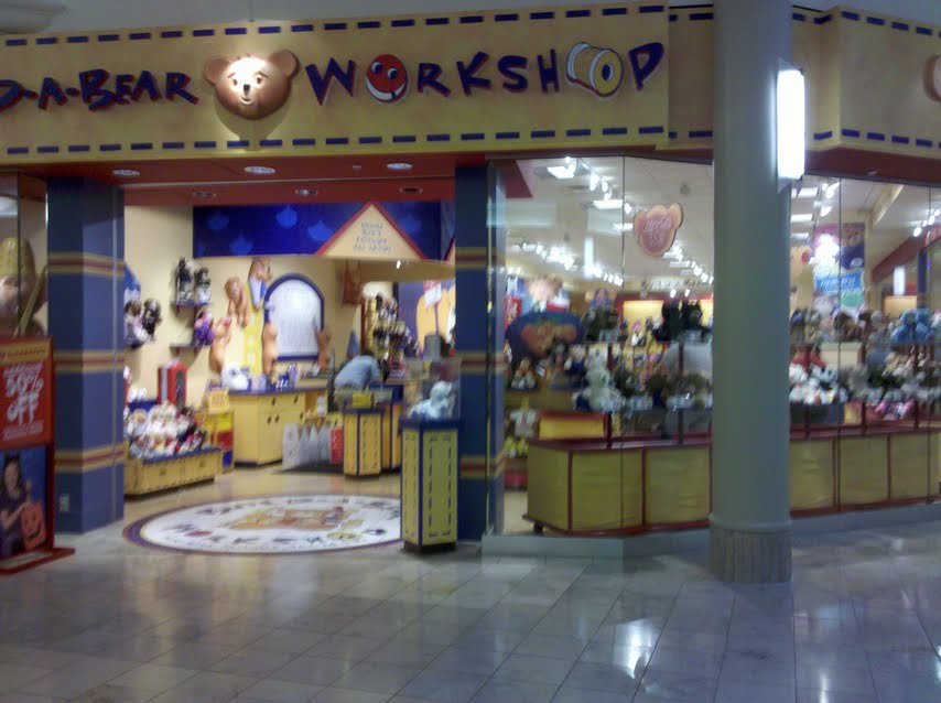
The outside of the store is mostly composed of windows. This allows children and parents to see the various stuffed animals that can be bought. From the doorway it is easy to see all the way to the back of the store. A large sign says "Build-A-Bear Workshop" in a kid friendly font with a smiling bear, buttons, and thread. Some merchandise spills out of the door.
Pop music seemed to be playing softly but at least one song mentioned building a bear. The music was quiet enough to not hinder having a conversation but loud enough that you don't feel like everyone can hear what you are saying.
All of the merchandise is displayed close to the ground. The bins containing the unstuffed animals were below my waist height and only a handful of things were above my head. Prices were one of the only things above a child's eye level. Merchandise is put where kids can easily see it and take it off the shelves. All of the clothing for the bears is displayed on cardboard hangers and on racks that look like a real clothing store. There is a lot of space in between the shelves, it would be easy for a parent with a stroller to get around.
The floor was light wood and seemed to be in good shape. It contrasts nicely with the merchandise and anything dropped on the floor would be easy to find.
The signs are very easy to read. They use all capital letters, a minimal number of words, and the font is large. Children learning to read would not have a difficult time figuring out what the signs say.
The cashier area, like everything else is low to the ground. The counter is substantially lower than a kitchen counter, but not so low that an adult would feel totally out of place. This allows most children to see the cashier and read "The Bear Promise" that is written behind the counter. This also occupies kids while their parents are paying.
Build-A-Bear is all about fun and is set up to be like a workshop. Primary colors and black are used to attract attention. Certain elements are made to look like a factory. The bins look like spools of thread and there is a stuffing machine. Build-A-Bear is also focuses on being interactive. The store is a loop and each section focuses on a different action: choose me, stuff me, fluff me, dress me, name me, and take me home. After picking out an animal, it must be stuffed. This forces the consumer farther back into the store where the clothes are. The signs imply that each step must be completed and that the consumer can't leave without buying clothes for the animal. Paco Underhill would call the clothes "add-ons".
Build-A-Bear has the visceral wow-factor for children. The bright colors and seemingly endless clothing options make their eyes go wide. From a behavioral point of view, the store is easy to get around in and the loop design seems natural. There is also a bathroom and drinking fountain in the store, which is unusual for a mall. Reflective design is very important, children get to feel like they are making something all their own. Each child puts a fabric heart in the center of the bear and the staff makes it into a big deal. Kids I saw had to jump on one foot, spin in a circle, make a wish, and kiss the heart before they could place in in the bear. Each bear even gets a birth certificate, customized with the "parent's" name.
The store is set up just like the one in Detroit and the one in Chicago. This allows people to visit any Build-A-Bear store and know exactly what to expect when they walk in the door.
I would like to note that no one offered to help me when I walked in. I am clearly not their target audience.
No comments:
Post a Comment