If you want a golden rule that will fit everybody, this is it: Have nothing in your houses that you do not know to be useful, or believe to be beautiful.
--William Morris
1. What seminar readings, exercises, or assignments were most challenging, interesting, or rewarding for you? Why?
My favorite readings were from Norman's The Design of Everyday Things and Emotional Design. They were easy to follow and a great base of knowledge for all the discussions we had afterward. "The Science of Shopping" and the chapter from City were my other favorite readings. They were especially effective because we had the opportunity to apply them to real life in our Retail Analysis presentations and our exploration of downtown Kalamazoo.
The Wikipedia paper was very interesting, but I'm still not really sure how it relates to design. I liked that we could really write about anything. I wish we had spent a bit of class time discussing what everyone had researched. I want to know if other people have stories behind the topic they chose.
The final presentation was the most difficult assignment. The size of the group meant a lot of ideas that often conflicted. It was also difficult to find an article for the class to read, a bit of direction would have been appreciated. Overall, I think our presentation turned out well.
2. What are the most important things you learned in this seminar?
Before this class I only knew a little bit about graphic design. I had no idea so many things had to be considered when designing a product, store or city. It is easy to infer basic principles about visceral and behavioral design, but I never would have thought about reflective design. I am definitely a more informed consumer now.
3. How might you use this learning in the future?
Every time I buy something I will evaluate it using some of the criteria we discussed during class. I am thinking about a major in anthropology/sociology or psychology and I think this all applies to some extent. It is also just interesting information to know.
And with that, I'm done blogging.
So long.
Tuesday, November 23, 2010
Friday, November 19, 2010
"The Secret to Turning Consumers Green" Questions
1. What are the author's main points in the article?
Companies who want consumers to go green should use peer pressure, not just ethical reasoning.
2. Do you think you would be more affected by peer pressuring advertisements than advertisements promoting green?
Advertisements need to have a good balance. Peer pressure is definitely a good motivator and it shows consumers that they will not be the only person not participating. I'm not sure what would be worse, being the only person to participate or the only person to not participate.
3. Give a personal story of you buying a product because of its environmental design.
My mom and I recently bought environmentally friendly light bulbs to put in our kitchen. Part of it was because they are environmentally friendly but most of it was because it means we will not have to change the bulbs as often. Another thing that factored into it is that my grandparents recently put the same bulbs in their house.
4. Give specific examples of products becoming environment-friendly.
Household cleaning item recently started to come concentrated from some companies. You can use the same squirt bottle and just add water. This helps cut down on the amount of plastic used. Cars are also focusing on becoming more environmentally friendly with hybrids and electric cars and even normal cars focusing on having better gas milage.
Wednesday, November 17, 2010
"Specialty clothing retailers this fall want to let shoppers know that they, too, are a brand" Questions
1. Select a quote from this article and explain how it relates to clothing advertising and brand identity.
''This campaign was designed to build top-of-mind awareness,'' said Catherine Sadler, the executive vice president of marketing at Ann Taylor. ''And to position us as accessible and relevant to our customers' lives.''
Brands want to always be hovering in consumers minds. When a woman thinks, "I need a new dress to wear to that party next week," brands want her next thought to be the name of their store. Too be more accessible, stores are advertising more everyday clothing items. Instead of a woman just thinking of their store for a dress she should also think of it when all she wants to buy is a t-shirt and a pair of jeans.
2. What are some examples of clothing companies that have iconic advertisements? Include an image of one of your examples and explain what it says about the brand. Who are they marketing to? What are they selling (both physically and reflectively)?
 Anthropologie's advertisements are always beautiful photographs that look like art. This image plays into the idea that their target audience is imaginative and adventurous. The gauzy fabric and chandelier also give it a romantic feeling. There is only one person in the photo, she does not need other people with her to feel secure. The clothing items don't exactly match but they complement each other. This gives the idea that they could be paired with other items from the store to create more outfits. This is a store for people who dream outside the box and want their clothing to reflect that.
3. How has brand image influenced your decision to buy or not buy clothing? Do the clothes define the people, or do the people define the clothes?
Clothing is an important part of who people are. First impressions have a lot to do with what someone is wearing and how they carry themselves. In these moments, people are defined by their clothes but when you know someone better you see how their clothing is a reflection of their personality.
I tend to focus on individual clothing items I like instead of the brand that it comes from. That having been said, there are many stores I will not go into because I don't think I will like anything based on how they brand their company. This includes stores like Hollister or Abercrombie and Fitch.
''This campaign was designed to build top-of-mind awareness,'' said Catherine Sadler, the executive vice president of marketing at Ann Taylor. ''And to position us as accessible and relevant to our customers' lives.''
Brands want to always be hovering in consumers minds. When a woman thinks, "I need a new dress to wear to that party next week," brands want her next thought to be the name of their store. Too be more accessible, stores are advertising more everyday clothing items. Instead of a woman just thinking of their store for a dress she should also think of it when all she wants to buy is a t-shirt and a pair of jeans.
2. What are some examples of clothing companies that have iconic advertisements? Include an image of one of your examples and explain what it says about the brand. Who are they marketing to? What are they selling (both physically and reflectively)?

3. How has brand image influenced your decision to buy or not buy clothing? Do the clothes define the people, or do the people define the clothes?
Clothing is an important part of who people are. First impressions have a lot to do with what someone is wearing and how they carry themselves. In these moments, people are defined by their clothes but when you know someone better you see how their clothing is a reflection of their personality.
I tend to focus on individual clothing items I like instead of the brand that it comes from. That having been said, there are many stores I will not go into because I don't think I will like anything based on how they brand their company. This includes stores like Hollister or Abercrombie and Fitch.
Sunday, November 14, 2010
"Cookie Cutter Housing: Wrong Mix for Subdivisions" Questions
1. What are the author's main points in this article?
Subdivisions are bland and not the best use of space. The developers and "The Ordinance" set up by committees are to blame for this. People need to voice their opinions and shake up the established order. I like his idea of placing houses closer together but staggering them so that windows on the sides of houses don't just look at another house.
2. How do you feel about subdivisions after reading this article? Are they a positive addition to city layouts or is urban sprawl a negative phenomenon? Why do you feel this way?
I have never liked subdivisions, they are definitely a negative phenomenon of urban sprawl. The article just reenforced my opinion. Everything a subdivision accomplishes could be done in a more inviting way, with houses built in different eras for families of all different sizes.
3. Do you live in or near a subdivision? What about the author's viewpoints are true or false, in your view (how is this article relevant to what you know?)
I live in a very small city, Huntington Woods, that mostly consists of a neighborhood. Most houses look different than the other ones on the block,we have many small parks and the irregular blocks are lined with trees.
 |
| My House |
 |
| My Neighbor to the Left |
 |
| My Neighbor to the Right |
 |
| An Unusual House a Few Streets Away |
 |
| Another Nearby House |
 |
| The Oldest House in the City |
A few years ago a friend who lives in a subdivision came to visit me. He commented that he really liked my "subdivision" because all the houses looked different.
I hate the idea of a row of houses that look exactly alike. Even when houses are different, subdivisions are either set up in rigid grids or are made up of a few streets that meander around and often double back to the same point.
I agree that houses that look the same and are all in a row are not aesthetically pleasing. The chapter we read from City talked about a good city block having buildings of different heights and widths that are made up of different materials. This, along with different lot sizes, is what makes my city appealing.
The other thing I hate about subdivisions is the lack of landmarks. I know how to get around Huntington Woods because I know some street names but mostly because I know where landmarks are in relation to each other. Most of these landmarks are interesting houses like the ones pictured above. In a subdivision where each street looks exactly like the next, I can't use these types of landmarks to get around.
Thursday, November 11, 2010
"The Biggest Mistakes in Web Design 1995-2015" Questions
1. How does this reading relate to the concept of user-focused design that we have discussed in class?
He stresses that the site needs to work for the user not for the designer. I especially like when he reorders the heading of one website to show how easy it would be to make it more user friendly. He really understands that frustrated users will leave a website to find a better one. he understands that users want things to load quickly and they want to be able to solve their problems quickly. Strangely, he doesn't care about doing this on his own site. I had a "problem", I had to read this article so I could write a blog and discuss it in class. He made it difficult. To fully understand his points, the reader has to watch videos and look at pictures. Most of the important pictures were in links that directed me to a different site and many of the videos just showed up as empty space. In number 12 he provides a link to "website photos of two dentist." Only one picture shows up. This was very frustrating, I would have left the site if it wasn't an assigned reading. His last two points also made no sense to me. They are written in computer-gibberish with no helpful links to tell you what he is talking about. His bad website and "<big grins>" when he talks about how bad his site is make me not trust his opinion on what makes a good website.
2. What points do you feel are the most important?
His most useful idea can't even be summed up by reading his 12 main points. Oh wait, there were 16, thats how much of an impression they didn't make. Anyway, the most important idea is that a website should be designed for the people who will visit it, not the people creating it.
3. Create your own list of important design factors for a webpage.
Easy to use
Nice to look at
Accomplish its desired goal
User focused
Safe
Load quickly
Tuesday, November 9, 2010
"The Future of Retail" Questions
1. Does Negroponte explicitly state his thesis? If so, identify it. If not, write your own thesis statement for his essay.
He doesn't explicitly state his thesis. He should say that retail is moving out of physical stores and onto the internet.
2. How does this reading relate to Norman's concepts of user-focused design?
Negroponte argues for Norman's idea that designs need to be user-focused. "Another kind of retail, however, is truly about to end - the type where you can't park, the checkout lines are interminable, the staff is disagreeable, and the product has always run out." There are a multitude of other places where consumers can shop, they don't need to be burdened with annoying stores. In some cases, consumers go out of their way to buy something at a local store. Store owners need to be aware of this and accommodate the shoppers more.
3. Negroponte published this in 1998; to what extent do his ideas remain relevant today?
It is even easier for people to purchase things online today than it was twelve years ago. The items that people buy are not quite the same ones that he talks about. People do buy books and clothing online but I have never heard of anyone in the Metro Detroit area buying groceries online. If mailboxes were going to change to large refrigerated boxes any time soon, you think we would have moved in this direction a bit already. I read that part of the article to a group of people and they all laughed, it seems absurd.
4. What predictions would you make about the Future of Retail?
I think retail will continue to exist in physical stores, for the most part. Book stores will probably cease to exist, especially with the introduction of so many e-readers. Malls and especially clothing and home goods store will continue to exist. Shopping is entertainment. People will continue to go shopping in stores as long as people continue to be bored. Lots of clothing shopping is done last minute when even one day shipping does not afford enough time. Clothing is also better when the consumer can try it on before purchasing it. Things like couches and chairs are also better when people can "try them on." I can't imagine buying a couch without sitting on it first. In regards to buying groceries online, I don't think it is practical. My family often buys food so we can go home right away and cook it. We don't always plan ahead far enough to tell a company when to send us certain food. We often walk into the grocery store not know what we will buy. I also can't imagine trusting a company to pick out fresh fruits and veggies for me. They want to sell all of their inventory so they might not give me the freshest produce. Overall, I think stores will continue to exist for a very long time.
Monday, November 8, 2010
Downtown Kalamazoo Questions
1. Write a short evaluation of Downtown Kalamazoo's business area using specific examples from Friday's observations.
Downtown Kalamazoo is effective for people who live in the surrounding area including college students, but not so great for visitors. The Kalamazoo Mall is a very pleasant shopping area and is easy to find if one is walking, but it would be very easy to drive right past it. It is a one way street with parallel parking on both sides which is helpful for the elderly or parents with small children. The traffic is sparse enough that pedestrians can safely cross at any point. The brick sidewalks were clean except for a few scattered leaves, but that is to be expected at this time of year. There are many planters with trees and colorful flowers alongside benches and tables with umbrellas. If parking is not available on the street there are many parking garages near by. The Mall is not far from K College's campus or Western's and has many restaurants and a few shops that would interest a college student. Overall, the Mall feels safe and welcoming.
The area around the Rave movie theater, one block away, is very different. The Rave sits on a corner, across from Pfizer's animal genetics complex, the courthouse and a lone shoe store. There is a large parking garage next door that seems to service the Mall. The Rave feels isolated and can seems a bit scary. I would not want to go there at night without a large group of people.
2. Give at least three recommendations to improve the downtown.
Fewer one way streets that can confuse visitors
More trash cans and benches on the streets that are not part of the Mall
More police presence
3. Select a brief passage from the article about Robert Gibbs or the reading from City by William Whyte and relate it to Kalamazoo's Downtown. Use specific observations from Kalamazoo to illustrate the point.
Food and the eating of it is Lexington's major activity and most of it takes place right on the street. Many of the shops have open counters: the fruit juice and pizza places, for example; the soft ice cream shop, which for good measure pushes the freezer out onto the sidewalk in fair weather. Some food shops have folding fronts; when they are folded back it is hard to tell where the sidewalk ends and the shop begins, a distinctions further blurred when the proprietors put out tables and chairs. (City, 86)
A Friday afternoon in November certainly is not peak hours for the Mall but I could imagine this happening on a warm summer evening. The tables and chairs the city have provided are perfect for carrying out food and people watching while you eat.
The Bootery is the one store that I noticed had a blurred entryway. There is a large covered area that is technically outside the store. The rectangle is surrounded on three sides by windows that showcase the various styles of boots the store has to offer. Window shopping in this area feels like actual shopping because of the roof overhead. I expect that the store displays tables full of shoes out here on nice, busy days.
Thursday, November 4, 2010
What The Mall Should Learn From Main Street
1. To what extent do Whyte and Gibbs approach city design from different perspectives? Do you find one more convincing than the other?
Whyte favors a more cluttered design and Gibbs likes things very clean and simple. Gibbs believes that there should be very few benches and if there are any they should face store windows so people are shopping even when they are taking a break. He doesn't create spaces for people to congregate and just wants them to funnel them into the next store. Whyte encourages people to window shop and congregate in front of doors or statues. He discusses obstacles in a walkway as a way to bring people into a store. Street-furniture is a good thing according to Whyte and a bad thing according to Gibbs.
I find Whyte's design more convincing than Gibbs. Whyte encourages people to mill about in shopping areas and many of them turn into buyers. Gibbs misses out on this accidental consumer because his mall designs are for people who go shopping with a purpose. Also, I can't stand shopping in an area where I am the center of attention, Whyte's designs would help to keep the focus off of me.
2. What elements of an urban area are particularly attractive to you? What elements repel you?
I love interesting architecture. The mismatched, old buildings that Whyte describes as his ideal shopping location are a big draw for me. I dislike streamlined commercial areas that feel clinical. I also enjoy shopping in an area where many people are wandering around. People watching keeps me in a shopping past the time I have bought everything I need and I often buy more because of it. Safety is also important in an urban area. Abandoned buildings are alright in some circumstances but they shouldn't feel creepy.
Wednesday, November 3, 2010
"City" Questions
1. What do you feel were the author's key points in this chapter?
Clutter can be a good thing. People want to be where there are lots of other people and a smaller sidewalk can give the appearance of more people. Obstacles in the sidewalk can help funnel people into stores. Stores should use the space on the sidewalk to sell merchandise, which can lead to more clutter. On the other hand, doorways should be unobstructed, with the doors left open when possible. People should be unsure as to where the sidewalk ends and the store begins.
Window displays are very important. Window shoppers bring other window shoppers and some of them turn into actual customers. The problem with most window displays is that they are designed to be viewed from about the middle of the street instead of the middle of the sidewalk. Movement, light, sound and mystery all grab people's attention.
The best streets have a wide variety of buildings and occupants in them. A mix of building types and materials used keeps the passersby interested a wide variety of stores, restaurants and services means they can find just about anything they need in one spot. Anything a city puts on the sidewalk should have multiple functions. Whyte's example is the trash can that can be used as a shelf as well. Objects like this attract people.
2. Compare Whyte's ideas on design to Norman's concepts that we studied earlier. What's similar? What's different?
The biggest similarity is the use of visceral design to catch people's attention. Whyte mention's flashing lights and bright window displays. These certainly have a wow factor. But he also mentions a window covered in brown paper with a few eye holes cut in it. This was very effective but can't be said to have a wow factor. Whyte also mentions many things that are not behavioral. Norman would want a clean, unobstructed walkway, much like the one from the reading about what Main Street can learn from the mall, but Whyte argues that clutter is functional. The two would share ideas about doorways, they should be open and easy to use without much thought. Norman would like Whyte's idea that everyday objects should have multiple functions, like the trashcan that is a table but could also be a footrest or a place to tie your shoes.
3. Create a checklist, based on Whyte's chapter, that could be used to analyze an urban area.
stores that open onto the sidewalk, two stories worth
large windows that show activity
good sidewalk, not too wide
trees
seating, trash cans, other multipurpose objects
a mix of different stores/restaurants
Sunday, October 31, 2010
"What Main Street Can Learn From the Mall" Questions
1. List the criteria Robert Gibbs uses to evaluate a Main Street.
Main Street
traffic
no left turns
concentration of stores
cleanliness of streets/sidewalks
attractiveness/price of trash cans similar items
parking
a reason for people to get out of their cars, destination
signs advertising brands
security
I agree that Main Street can learn a lot from malls but it should retain its individuality. Shopping downtown is appealing because there are more independent boutiques but also because all of the buildings don't look the same. Matching streetlights, trash cans, and benches are nice but should be mixed with old brick buildings and new construction. Different shaped windows and doors and buildings made of different materials are much more appealing than the off-white and stainless steel that is found in malls. It is important for Main Street stores to retain their individuality.
3. Make your own checklist to judge a Main Street
parking
desirable stores for different audiences, more than one store for each audience
easy to walk around, only have to park once
mix of stores and restaurants with varying prices
security
window displays that accurately depict what is in the store
clean streets/sidewalks
Thursday, October 28, 2010
Wikipedia Article: Original Paper
Earl Young (born March 31, 1889 - May 24, 1975) was an American architect, realtor and insurance agent. Over a span of 52 years, he designed and built 31 structures in Charlevoix, Michigan but was never a registered architect. (The Life and Works of Earl Young Charlevoix’s Master Builder in Stone. DVD. Written by David L. Miles.) He worked mostly in stone, implementing boulders he found all over Northern Michigan. The homes are commonly referred to as gnome homes, mushroom houses, or Hobbit houses (The Life and Works of Earl Young Charlevoix’s Master Builder in Stone. DVD. Written by David L. Miles.). His door, window, roof and fireplace designs were very distinct because of his use of curved lines. Young’s goal was to show that a small stone house could be as impressive as a castle. Young also helped make Charlevoix the busy, summer resort town that it is today (The Life and Works of Earl Young Charlevoix’s Master Builder in Stone. DVD. Written by David L. Miles.).
Early Life
Earl Young was born in Mancelona, Michigan in 1889 to parents Adolf and Myrtie Young. He moved to Charlevoix at 11 years old where his father set up an insurance business. As a teenager, Young was interested in photography and taught himself photofinishing. He took many photos in Charlevoix, of both the city and the woods. In high school, he was on the skating team and the track team. During his senior year, Young was coeditor of his school’s newspaper with Irene Harsha, who would later become his wife. In 1908, he enrolled in the University of Michigan’s School of Architecture. He was influenced by Frank Lloyd Wright’s idea that buildings should respect their surroundings. Young was discouraged by the classic Greek, Roman, and Victorian architecture he was learning about and left school after only one year (The Life and Works of Earl Young Charlevoix’s Master Builder in Stone. DVD. Written by David L. Miles.).
That was the last time Young would have any formal schooling. He joined his family’s insurance business, which soon expanded to include realty. For the rest of his life, he would say he was a realtor and would proudly tell people that he had held his realtor’s license for 60 years. (The Life and Works of Earl Young Charlevoix’s Master Builder in Stone. DVD. Written by David L. Miles.) In the same building as the insurance agency, Young also ran a photofinishing business and sold bread. During this time, he continued to learn about architecture and construction by reading books and magazines and talking to construction workers and stonemasons. On February 14, 1914 Myrtie Young died and Earl was left alone in the family business(The Life and Works of Earl Young Charlevoix’s Master Builder in Stone. DVD. Written by David L. Miles.).
On September 21, 1915 Young married Irene, his high school sweetheart. He joked that he married her to, “keep her on his staff.” (The Life and Works of Earl Young Charlevoix’s Master Builder in Stone. DVD. Written by David L. Miles.) Over the next 11 years their family grew to include four children: Drew, Marguerite, Louise, and Virginia.
Young developed some bad habits very early and they continued with him throughout his career. He was a difficult architect to deal with. He never made blueprints; workers were lucky to get a rough sketch that was refined by Irene. Young also never thought about practicality, making very short doorways and kitchens like hallways. He was an on-the-spot designer and said the stones spoke to him. When asked which building was his favorite, Young would always respond, “The next one.” (Fox, Thomas. “Stone Lover Builds Solid, Artful Heritage”. Detroit Free Press, 1973.)
First Homes
Earl Young had been studying the houses in Charlevoix County for years. He believed that these houses could be mixed up and put back on any plot of land with no consequences. He wanted to build homes that fit into their landscape. This philosophy was shared by Frank Lloyd Wright. From 1918 to 1921 he worked on his first building at 304 Park Avenue (The Life and Works of Earl Young Charlevoix’s Master Builder in Stone. DVD. Written by David L. Miles.). It was built mostly of stone with a few wooden details and an Arts and Crafts influence. This home respected the contours of the land and contained the first of his celebrated stone fireplaces. He built it for his family to live in.
In 1920, he built a new insurance office for himself. It was called the Apple Tree Building after the tree that grew behind it. The building had to be removed in 2003, but the fireplace was saved (The Life and Works of Earl Young Charlevoix’s Master Builder in Stone. DVD. Written by David L. Miles.).
Young bought a large piece of land on Lake Michigan from Mary Bartholomew in 1924. He broke the land up into 85 lots, only three of which were rectangular, and began advertising Boulder Park. Lots started at $100 and the first floor of any house that was built had to be made of stone, brick, or stucco. Young designed and built 10 homes in Boulder Park, although it is a common misconception that he built all of the homes there since many homeowners had their houses commissioned “in the style of” Earl Young. (The Life and Works of Earl Young Charlevoix’s Master Builder in Stone. DVD. Written by David L. Miles.)
From 1927 to 1930, he worked on a house with green mortar between the stones. It was heavily influenced by Frank Lloyd Wright and was the first of Young’s homes to have a deemphasized, almost hidden entryway. At the same time, he worked on a house made of rough stone with his first remarkable chimney- the chimney seemed to be made of randomly placed stones and the top of it appeared to be frosted with snow. Both homes have a door and stairs that face the road but no walkway that leads to them (The Life and Works of Earl Young Charlevoix’s Master Builder in Stone. DVD. Written by David L. Miles.).
The next home Young built resembled an English cottage. It was built from 1928 to 1929 with flat white stones and white mortar. Its rolled eaves are the first clue to the undulating roofs Young would later construct (The Life and Works of Earl Young Charlevoix’s Master Builder in Stone. DVD. Written by David L. Miles.).
From 1929 to 1930, Young built two homes. The first was mostly comprised of stones with red mortar between them. The stucco gables playfully have eight stones “tossed” into them. This is the only home he built without a sheltered entrance. The second of the two homes has a distinct Swiss Chalet influence (The Life and Works of Earl Young Charlevoix’s Master Builder in Stone. DVD. Written by David L. Miles.).
In 1930, Herman Panama commissioned a home made of cobblestone from Young. The house is called The Norman Panama House after Herman Panama’s son, a Hollywood producer, writer, and director. (Barton, Mike. Mushroom Houses of Charlevoix. pg. 23.)
Young designed a home called The Owl House, which was constructed from 1930 to 1931. The house was made entirely of granite. It received its name from the two round windows on its front that resemble eyes (The Life and Works of Earl Young Charlevoix’s Master Builder in Stone. DVD. Written by David L. Miles.).
The Enchanted Cottage was built next. It is the only structure that Young built but did not design. This is evident because the house has many straight lines and right angles, unlike Young’s other homes. Mr. and Mrs. Cross convinced Young to build the house based on House Pattern 357 from Ladies Home Journal. He gave it his own touch with a stone exterior and a slight change to the dormer windows (The Life and Works of Earl Young Charlevoix’s Master Builder in Stone. DVD. Written by David L. Miles.).
Soon after, he bought The Golden Rule, a sailboat, from a friend. Young convinced the Coast Guard to haul it out in front Boulder Park and beach it. Its only purpose was to act as a conversation piece, although, Lake Michigan’s rough summer waves and harsh icy winters soon demolished the boat (The Life and Works of Earl Young Charlevoix’s Master Builder in Stone. DVD. Written by David L. Miles.).
Young’s next home was The Pagoda House, finished in 1935. Constructed of limestone, it had Oriental, Gothic and Swiss influences (Barton, Mike. Mushroom Houses of Charlevoix. pg. 19.). This was the last home he built in Boulder Park.
Boulder Manor
Building Boulder Manor was considered the turning point in Earl Young’s architecture. It is the most well known home in Boulder Park (The Life and Works of Earl Young Charlevoix’s Master Builder in Stone. DVD. Written by David L. Miles.). For years Young had been saving boulders both physically and mentally. He had the ability to remember the dimension and colors of hundred of boulders at the same time, over the span of many years. He dug up the boulders he liked, sometimes having to purchasing them. He hid them underground, deep in the woods, or in Lake Michigan. Many of these boulders came together when he started building Boulder Manor for his family in the fall of 1928. He built a playhouse in the backyard, that is basically a miniature replica of the main house. His daughters and their friends played inside while he oversaw work on the big house. The playhouse has a working fireplace and electricity. Unfortunatly, in 1929 the Depression hit and Young had to sell the unfinished house to the bank (The Life and Works of Earl Young Charlevoix’s Master Builder in Stone. DVD. Written by David L. Miles.).
For many years he worked on other homes and on December 9, 1937 he finally regained possession of Boulder Manor. The house was finished in 1939. The fireplace is composed of six massive boulders that form a trapezoid shaped mantel. The front of the house is dominated by an arched window that gives a spectacular view of Lake Michigan. One stone on the South side of the house juts up into the vinyl siding, fusing the two materials together to create one cohesive building.
Later Homes
Young purchased a triangular piece of land between Park Avenue, Grant Street, and Clinton Street. Many of his next houses were built either here or nearby. Abide was the first of these homes. It had even fewer straight lines than its predecessors, which was especially apparent in the roof. Young liked to say that he “built roofs and then shoved the houses underneath.” (Sculley, Bob. “Creative Home Builder Ignores Old Age, Almost...”. Ludington Daily News, 1971.) Because he refused to cut down trees on the property, they looked like they grew around the house. Abide has Young’s first fireplace made of Onaway stone.
Around this time, Young convinced the community to demolish buildings that blocked the view of Round Lake from Bridge Street. The four block area was turned into a park that is still enjoyed today (The Life and Works of Earl Young Charlevoix’s Master Builder in Stone. DVD. Written by David L. Miles.).
In 1943, Tide Beside Abide-- or Betide-- was constructed. It sits far back from Park Avenue and drops down the back of the hill. This makes the home look three times smaller from the front than it actually is (Barton, Mike. Mushroom Houses of Charlevoix. pg. 33.).
In 1945 Young constructed a cottage across from Abide. It had a thatched roof imported from Europe, whitewashed stones, and dark wood. The roof was later changed to shingles to make maintenance easier, and the whitewash was removed from the stones (The Life and Works of Earl Young Charlevoix’s Master Builder in Stone. DVD. Written by David L. Miles.).
When Young’s children moved out, he built a new home for himself and Irene at 306 Park Avenue. The house is made of Onaway stone and the roof mimics the swells of the hills surrounding it. The fireplace is composed of more Onaway stone and the horizontal and vertical pieces come together to make two diagonal lines. Diagonal lines on fireplaces proved to become more pronounced on his later buildings. Young lived here for almost 30 years (Barton, Mike. Mushroom Houses of Charlevoix. pg. 33.).
Young’s smallest building, Half House, was finished in 1947. It has a steep, wavy roof and stops flat on the East side with a high chimney (Barton, Mike. Mushroom Houses of Charlevoix. pg. 33.).
The next home was created for Speedway 79 founder William Sucher in 1948. Young walked the land with Sucher and his wife and at one spot stopped and told them: “From this spot I want you to see one third sky, one third water, and one third grass.” (The Life and Works of Earl Young Charlevoix’s Master Builder in Stone. DVD. Written by David L. Miles.) This type of behavior was not unusual for Young.
In 1951, Young built the now most photographed home in Charlevoix, which the owner calls Boulderdash (Barton, Mike. Mushroom Houses of Charlevoix. pg. 33.). It was modeled after a button mushroom. It is said that the exact square footage cannot be found because the floor plan is so irregular. The boulder walls are three feet thick and the undulating roof had to be complete twice because the first time the shingles were put on in neat rows, not the chaotic, sweeping billows Young wanted. The leaded glass windows were originally in a Polish castle (Barton, Mike. Mushroom Houses of Charlevoix. pg. 31.).
Between 1952 and 1962 Young remodeled three homes, usually adding stone to the fireplace and to the exterior of the homes. He also constructed two homes, one was for the mayor of Charlevoix (The Life and Works of Earl Young Charlevoix’s Master Builder in Stone. DVD. Written by David L. Miles.).
The Weathervane
Young tore down an old mill to create The Weathervane Inn which opened in July of 1954. The impressive restaurant houses five fireplaces. The one in the dining room includes a nine ton boulder that was one of Young’s favorites. He buried the stone for 26 years before he found the perfect place for it. It is similar to the shape of Michigan’s lower peninsula and Young thought that the lines bisecting it looked the the highways crisscrossing the land. The first time the boulder was put in place, the floor sank because it was so heavy. The roof of The Weathervane Inn mimics the outstretched wings of a seagull in flight. The gull motif is also found in fireplaces in The Weathervane compound and a few houses (The Life and Works of Earl Young Charlevoix’s Master Builder in Stone. DVD. Written by David L. Miles.).
The Weathervane Lodge opened in August of 1959. The square, two story building houses 37 units and is still in use today, but is simple known as The Lodge. At the time, it was the only two story motel with a passenger elevator (“Ultra-Modern, 2-Story Motel at Charlevoix Will Be-One of Michigan’s Finest”. Grand Rapids Press, 1959.). For the Weathervane Terrace Motel, Young seems to have drawn influence from nearby Castle Farms, but he never admitted it. Young experienced financial difficulties during construction, but the motel was finally finished in 1965. The main fireplace features red, gold and black stone. The fireplace in the breakfast room is made of five huge stones that fit together like a perfect puzzle. Young sold out of the Weathervane buildings in 1968 but retained his office for the rest of his life (The Life and Works of Earl Young Charlevoix’s Master Builder in Stone. DVD. Written by David L. Miles.).
Other Projects
In 1967, Young started working on land that faced Round Lake. He called the area Thistle Down. The first home here was an A-frame with very little stone on the exterior. The stairway was constructed with discs cut from a single log. The flamboyant fireplace uses the same stylized gulls as The Weathervane. A red sandstone house was built in 1969, and bulldozed in 1994. From 1970 to 1973 Young worked on The Castle House, his last completed design (Barton, Mike. Mushroom Houses of Charlevoix. pg. 43.). Today, it has been incorporated into a much larger home but still retains its Earl Young flair.
One house was constructed outside of Charlevoix. After much pestering Young built the Suchers another house in Alma, Michigan. It is made of Onaway stone and the fireplace is a full wall of diagonal lines.
In the 1930’s Young dragged a 40 ton boulder out in front of Boulder Park. 40 years later, he upended it where it sits today, proudly proclaiming the beginning of Boulder Park (The Life and Works of Earl Young Charlevoix’s Master Builder in Stone. DVD. Written by David L. Miles.).
Later Life
Young went to his office everyday. He continued to find new boulders, sketch ideas and dream. At 86 years old he slipped on a patch of ice and broke a hip. He was hospitalized and passed away on May 24, 1975 (The Life and Works of Earl Young Charlevoix’s Master Builder in Stone. DVD. Written by David L. Miles.).
Style
Young constructed homes during the Mid-Century Modern Era of architecture. This era is known for integrating nature into the houses, as Young always did. He would work around trees instead of cutting them down and wanted the houses to be part of the landscape instead of concurring it. Architecture from this time features open, flowing floor plans and the beginning of post and beam structures with light, glass walls. Many of Young’s homes have open floor plans but the stone walls never feel delicate. Like other buildings from the period, the stone houses are less formal than their predecessors. This informality is mainly shown by the lack of straight lines. The largest difference between Young’s homes and those of his contemporaries is who the houses are designed for. Other homes were built for the contemporary American family and their needs, but Young built only for himself. His awkward, hallway-like kitchens have been remodeled in many homes to make them more user friendly (The Life and Works of Earl Young Charlevoix’s Master Builder in Stone. DVD. Written by David L. Miles.). Young is often compared to Frank Lloyd Wright because of his integration with nature and his stubborn attitude, but critics have never formally compared the two architects.
Sunday, October 24, 2010
Retail Analysis.
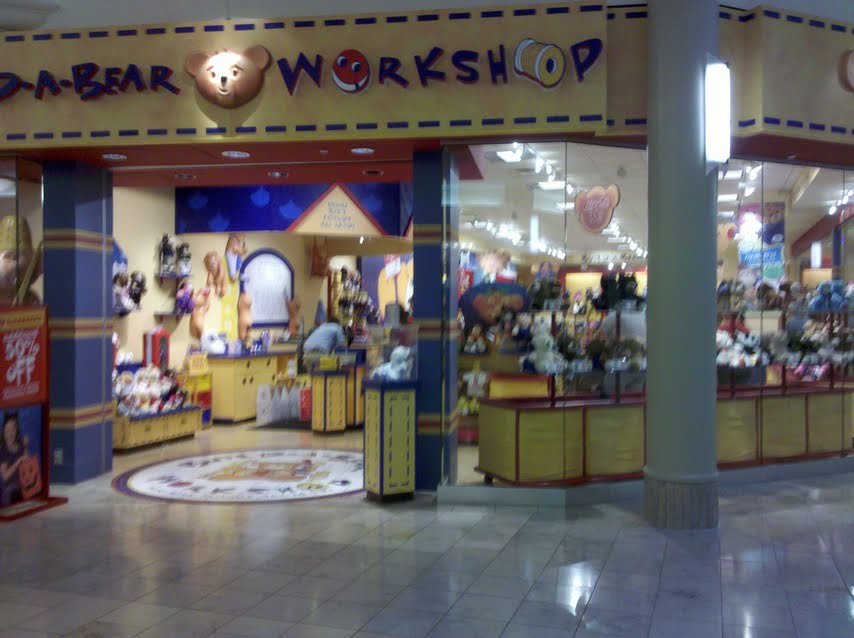
I observed Build-A-Bear Workshop. Build-A-Bear's target audience is children, from babies to middle schoolers. Usually the child is not paying for the bear so the store must appeal to parents, grandparents and other family members.
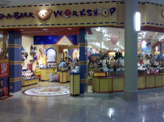
The outside of the store is mostly composed of windows. This allows children and parents to see the various stuffed animals that can be bought. From the doorway it is easy to see all the way to the back of the store. A large sign says "Build-A-Bear Workshop" in a kid friendly font with a smiling bear, buttons, and thread. Some merchandise spills out of the door.
Pop music seemed to be playing softly but at least one song mentioned building a bear. The music was quiet enough to not hinder having a conversation but loud enough that you don't feel like everyone can hear what you are saying.
All of the merchandise is displayed close to the ground. The bins containing the unstuffed animals were below my waist height and only a handful of things were above my head. Prices were one of the only things above a child's eye level. Merchandise is put where kids can easily see it and take it off the shelves. All of the clothing for the bears is displayed on cardboard hangers and on racks that look like a real clothing store. There is a lot of space in between the shelves, it would be easy for a parent with a stroller to get around.
The floor was light wood and seemed to be in good shape. It contrasts nicely with the merchandise and anything dropped on the floor would be easy to find.
The signs are very easy to read. They use all capital letters, a minimal number of words, and the font is large. Children learning to read would not have a difficult time figuring out what the signs say.
The cashier area, like everything else is low to the ground. The counter is substantially lower than a kitchen counter, but not so low that an adult would feel totally out of place. This allows most children to see the cashier and read "The Bear Promise" that is written behind the counter. This also occupies kids while their parents are paying.
Build-A-Bear is all about fun and is set up to be like a workshop. Primary colors and black are used to attract attention. Certain elements are made to look like a factory. The bins look like spools of thread and there is a stuffing machine. Build-A-Bear is also focuses on being interactive. The store is a loop and each section focuses on a different action: choose me, stuff me, fluff me, dress me, name me, and take me home. After picking out an animal, it must be stuffed. This forces the consumer farther back into the store where the clothes are. The signs imply that each step must be completed and that the consumer can't leave without buying clothes for the animal. Paco Underhill would call the clothes "add-ons".
Build-A-Bear has the visceral wow-factor for children. The bright colors and seemingly endless clothing options make their eyes go wide. From a behavioral point of view, the store is easy to get around in and the loop design seems natural. There is also a bathroom and drinking fountain in the store, which is unusual for a mall. Reflective design is very important, children get to feel like they are making something all their own. Each child puts a fabric heart in the center of the bear and the staff makes it into a big deal. Kids I saw had to jump on one foot, spin in a circle, make a wish, and kiss the heart before they could place in in the bear. Each bear even gets a birth certificate, customized with the "parent's" name.
The store is set up just like the one in Detroit and the one in Chicago. This allows people to visit any Build-A-Bear store and know exactly what to expect when they walk in the door.
I would like to note that no one offered to help me when I walked in. I am clearly not their target audience.
Friday, October 22, 2010
Egg Drop Design. The Funk.
It was important to us to make a pretty container and have some fun with it. We looked through the recycling behind Hoben to find a small box and used printed duct tape to seal it and add some interest. We then put small balloons around the outside, I think we used about 20. Larger balloons would have been better but we didn't have any. We filled the box with bubble wrap and did a test drop without the egg. In Hicks we dropped it down two stories and it seemed to work well. Before the drop during class we didn't make sure that the egg was in the center of the box surrounded by the bubble wrap. The egg was right near the top and its weight made the top hit the ground first resulting in the egg breaking. The egg being in the center of the box would have made a huge difference. I would also like to try it with bigger balloons or a larger number of small balloons.
You can find Shelbi's blog here.
You can find Shelbi's blog here.
Wednesday, October 13, 2010
"The Science of Shopping" Questions
1. What points from this article do you feel are the post important?
The consumer is constantly evolving. The change in the way makeup is sold is a great example. We are more independent, instead of relying on someone to dress us, we want to come up with our own look. This really plays into how much contact we have with sales people too. When I walk into a store, I expect someone to say hello, offer me help if I need it and then leave me alone. I don't want a person following me around, constantly suggesting things. I also liked the anecdote about the father grocery shopping with his kids. The idea of avoiding the cookie aisle is so obvious that it is clever.
2. How much do you personally feel you are influenced by a store's design?
I am definitely influenced by a store's design. I dislike stores with expansive white walls and harsh lighting. As far as the floor plan goes, I like to be able to see the door (or at least know exactly where I am in relation to it) at all times. Being lost in a maze of smaller rooms that don't always connect, like in Forever 21 or Saks Fifth Avenue, makes me feel uncomfortable. My favorite store is Anthropologie. I always go in even if it is just to see how the windows are decorated. I have seen arches made of books, flowers made of 2 liter pop bottles and snowflakes made of newspaper. Once I have seen the decorations I make my way to the back of the store where the keep the sale items. And that's where the get me, on the way I see a dress that would be cute for my cousin's bar mitzvah or any other number of things I want.

3. Make a check list you could use to analyze a retail store like Paco Underhill does.
Is there enough merchandise that the consumer has options but is not overwhelmed? Are the employees nice but willing to leave you alone? Are stores across the country set up in a similar way? How long are checkout lines? Does the store pull the customer in? Does the consumer want to spend time in the store?
The consumer is constantly evolving. The change in the way makeup is sold is a great example. We are more independent, instead of relying on someone to dress us, we want to come up with our own look. This really plays into how much contact we have with sales people too. When I walk into a store, I expect someone to say hello, offer me help if I need it and then leave me alone. I don't want a person following me around, constantly suggesting things. I also liked the anecdote about the father grocery shopping with his kids. The idea of avoiding the cookie aisle is so obvious that it is clever.
2. How much do you personally feel you are influenced by a store's design?
I am definitely influenced by a store's design. I dislike stores with expansive white walls and harsh lighting. As far as the floor plan goes, I like to be able to see the door (or at least know exactly where I am in relation to it) at all times. Being lost in a maze of smaller rooms that don't always connect, like in Forever 21 or Saks Fifth Avenue, makes me feel uncomfortable. My favorite store is Anthropologie. I always go in even if it is just to see how the windows are decorated. I have seen arches made of books, flowers made of 2 liter pop bottles and snowflakes made of newspaper. Once I have seen the decorations I make my way to the back of the store where the keep the sale items. And that's where the get me, on the way I see a dress that would be cute for my cousin's bar mitzvah or any other number of things I want.
 |
| The focus isn't even the clothing |

3. Make a check list you could use to analyze a retail store like Paco Underhill does.
Is there enough merchandise that the consumer has options but is not overwhelmed? Are the employees nice but willing to leave you alone? Are stores across the country set up in a similar way? How long are checkout lines? Does the store pull the customer in? Does the consumer want to spend time in the store?
Sunday, October 10, 2010
"Isn't it Iconic?" and "The Power of The Box - Powerful Packaging Design" Questions
1. To what extent is packaging important in marketing a product? Give an example of how a package influenced your decision to buy (or not buy) something.
Packaging is very important when marketing a product. On busy store shelves a consumer needs to be able to recognize what they want or be draw to a particular brand if they are not sure what they want. Packaging is especially important when it comes to beverages. This is one of the few products where the packaging is not immediately thrown away. I don't drink wine but I like shopping for it with my parents because the labels are so interesting. For me it is not at all about taste, but about how the bottle will look on the wine rack or sitting on the table. Labels have to be viscerally appealing but also show others what you find beautiful or interesting, so they are reflective. I prefer labels that use black, white and a bold color. Oddly shaped labels also help set some bottles apart from others.
Arizona Iced Tea comes in a distinct tall can. Jones soda is also very unique. The pop is brightly colored and the labels are usually black and white photographs submitted by consumers.

I also bought premium m&ms because the package was so pretty. The box has subtle curves and was metallic shades of brown.
The cover of a book is another type of important packaging. I was at Borders one day and saw a hardcover book where the cover was split down the middle so that two flaps opened up. I immediately picked it up and smiled when I saw that it worked with the title "The Divide". I bought the book and had many people comment on it while I was reading it. This was in middle school, it is still my favorite book cover. Without this cover, I may have never picked up the book.
2. What other products have iconic packaging?
Apple has very iconic packaging. Every piece features a white background with black type and a color image of the product. Their packaging is also very representative of the size of the product. Ipods come in small boxes, maybe twice the size of the ipod. At one point they had some black packaging with white type but I believe they have returned to all white.
McDonalds Happy Meal also has iconic packaging. Commercials always feature a red box with the golden arches as the handle. Every time I got a Happy Meal as a kid it came in the normal paper bag but I still associate it with the red box.
It isn't yet well know, but BluRay DVDs have a very distinct design. They are similar to a normal DVD case but shorter, thinner and the plastic is blue. If BluRay makes a breakthrough it will become iconic.
3. What usability issues exist for packaging? Give examples of particularly good or bad packaging from a usability perspective.
Packaging should easily let the consumer know what is inside. It should be easy to remove. It needs to keep the product safe, but there should not be too much of it. The packaging on CDs is horrible. It takes forever to unwrap and CD. I understand that they want to make it difficult for people to steal them, but there has to be a better way to do it. Apple does a good job not putting too much padding in their boxes. When buying a bottled drink, the top should be secure so that the consumer knows it has not been tampered with, but it should not be so tight that the consumer cannot get it off.
None of the images used here belong to me.
Packaging is very important when marketing a product. On busy store shelves a consumer needs to be able to recognize what they want or be draw to a particular brand if they are not sure what they want. Packaging is especially important when it comes to beverages. This is one of the few products where the packaging is not immediately thrown away. I don't drink wine but I like shopping for it with my parents because the labels are so interesting. For me it is not at all about taste, but about how the bottle will look on the wine rack or sitting on the table. Labels have to be viscerally appealing but also show others what you find beautiful or interesting, so they are reflective. I prefer labels that use black, white and a bold color. Oddly shaped labels also help set some bottles apart from others.
 |
| Black, White and Red Color Scheme. Easy to Read Font. |
 |
| Thin Label, Very Low on the Bottle is Eye-catching. |
 |
| Clever. Black, White and Red. |
 |
| Black with Two Colors. |
 |
| Black and White. No Words on the Main Label. |
 |
| Black and White. |
I also bought premium m&ms because the package was so pretty. The box has subtle curves and was metallic shades of brown.
The cover of a book is another type of important packaging. I was at Borders one day and saw a hardcover book where the cover was split down the middle so that two flaps opened up. I immediately picked it up and smiled when I saw that it worked with the title "The Divide". I bought the book and had many people comment on it while I was reading it. This was in middle school, it is still my favorite book cover. Without this cover, I may have never picked up the book.
2. What other products have iconic packaging?
Apple has very iconic packaging. Every piece features a white background with black type and a color image of the product. Their packaging is also very representative of the size of the product. Ipods come in small boxes, maybe twice the size of the ipod. At one point they had some black packaging with white type but I believe they have returned to all white.
McDonalds Happy Meal also has iconic packaging. Commercials always feature a red box with the golden arches as the handle. Every time I got a Happy Meal as a kid it came in the normal paper bag but I still associate it with the red box.
It isn't yet well know, but BluRay DVDs have a very distinct design. They are similar to a normal DVD case but shorter, thinner and the plastic is blue. If BluRay makes a breakthrough it will become iconic.
3. What usability issues exist for packaging? Give examples of particularly good or bad packaging from a usability perspective.
Packaging should easily let the consumer know what is inside. It should be easy to remove. It needs to keep the product safe, but there should not be too much of it. The packaging on CDs is horrible. It takes forever to unwrap and CD. I understand that they want to make it difficult for people to steal them, but there has to be a better way to do it. Apple does a good job not putting too much padding in their boxes. When buying a bottled drink, the top should be secure so that the consumer knows it has not been tampered with, but it should not be so tight that the consumer cannot get it off.
None of the images used here belong to me.
Friday, October 8, 2010
"Know it All" Questions
1. What do you think are the author's main points in this article?
The author wants people to be aware that Wikipedia is not always the most truthful source, but many of her other points are more important. The process of removing vandalism and editing seems more important than the actual vandalism or incorrect information. She portrays Wikipedia as a social place as well as an encyclopedia. It is emphasized that entries are made by normal people. This can decrease the reliability but also makes articles easier for the average person to understand.
2. An important part of credible writing is selecting good supporting evidence. Select a passage from this article that illustrates the effective use of supporting detail. Explain why you think it is particularly effective.
Is Wikipedia accurate? Last year, Nature published a survey comparing forty-two entries on scientific topics on Wikipedia with their counterparts in Encyclopædia Britannica. According to the survey, Wikipedia had four errors for every three of Britannica’s, a result that, oddly, was hailed as a triumph for the upstart.
For years my teachers have been telling me never to use Wikipedia as a source for a paper. They alway say that it is full of errors because anyone can edit it. I like that this passage uses statistics to clarify the issue. I agree that Wikipedia is not the best source to go to for research but teachers need to say that other resources have errors too. They like to think that anything published is perfect and everything on the internet is rubbish. Statistics certainly help clarify issues like these but it is important to be wary of the reason the statistic was made. Did Nature want to establish Wikipedia as a credible source? Did they want to further discredit it?
3. Throughout the article, the author compares Wikipedia to the Encyclopedia Britannica, but not specifically on design. How would you compare the two encyclopedias from a design perspective?
Wikipedia is more user friendly than Encyclopedia Britannica. You can search Wikipedia and it will redirect you if you searched for something under the wrong title. Wikipedia also has links in each entry so you can easily look up a related topic without having to flip through pages or have many volumes open. Wikipedia is nice because it doesn't take up space or weigh anything. I can easily pull out my phone and look something up, the only limitation is having cell phone service. I guess the print version of Encyclopedia Britannica is good because you don't need electricity to use it. Wikipedia is also good because it is free. According to their website, Encyclopedia Britannica online costs $70 per year and the print version costs more than $1300.
I just went to Britannica.com to see how the pages are set up. They are very similar to Wikipedia but only part of the page scrolls up and down. This restricts the amount of information the reader can look at at one time. The scrolling is also very jumpy and sometimes not responsive. Wikipedia has a link to each part of the article after the first paragraph, Britannica has a table of contents but it is a drop down menu that is more difficult to see. Overall, Wikipedia is more user friendly.
Thursday, September 30, 2010
"Organization and Presentation Tips" Questions
1. What do you think are the author's most important points?
"Start with the end in mind" It is a lot like going on a trip. If you don't know where you are going before you get in the car with will end up driving in circles or getting lost.
"Know your audience as well as possible" You can't successfully give a presentation written for PhDs to a group of middle schoolers.
"Keep it simple" Your audience is never going to remember everything. Coming up with a main question and three main points will help you figure out what to emphasize.
2. How might you apply his advise to your own presentation?
Knowing the audience is easy. They are my peers and we have been learning about design together, so we all know roughly the same amount. The main question is whether or not our product is designed well. Our three main points will most likely reflect Norman's three types of design, Visceral, Behavioral, and Reflective. Our end goal is to prove that we know what we are talking about and are able to communicate it.
3. What do you think presentation preparation has in common with product design?
Visceral design certainly factors into a presentation. Handouts and Powerpoints should be pleasing to look at. Presenters should also dress well. Like a good design, enough information should be given to the audience that they don't need to do research to understand it. It should also be well organized. A presenter is basically selling his idea, it needs to be appealing to the audience.
4. Briefly discuss the areas of design you would be most interested in exploring.
I would like to explore how designers test their products on real people and how they collect and interpret the information. I would also like to learn more about how advertisements are designed.
Tuesday, September 28, 2010
"Emotional Design" Questions Part Deux
1. Select a brief passage from Chapter Three Emotional Design by Donald Norman and post it on your blog. Explain why you thought it was interesting.
An interesting exception to these problems comes when designers or engineers are building something for themselves that they will use frequently in their everyday lives. Such products tend to excel. As a result, the best products today, from a behavioral point of view, are often those that come from the athletic, sports, and craft industries, because these products do get designed, purchased and used by people who put behavior above everything else. (82)
It is easy to get wrapped up in criticizing designs but this passage helps explain why some designs work well. I feel like this idea could be applied to many different types of products. One of the most important parts of design is identifying the group that you are trying to sell to. It doesn't always makes sense for a person from that group to design the product, but extensive research should be done. This research should help the designers identify problems the consumer didn't even know they had, and then they should be solved.
2. Norman uses the terms Visceral Design, Behavioral Design, Reflective Design. Do these categories seem useful to you? Would other names or phrases make the category clearer?
Behavioral Design makes sense for the term but it should simply be called Ease Of Use. Reflective Design has the most confusing definition but once it is understood , it does relate to the term. I can't think of a better name for it. The word visceral meant absolutely nothing to me before reading this chapter, and still means very little. This should be called the Wow Factor. The nice thing about Norman's terms is that they all end in the word design, this makes them fit together nicely.
3. How could a designer decide if Visceral Design, Behavioral Design, or Reflective Design is more important for a particular product? Are some types of products more visceral, behavioral, or reflective?
The main type of design should be based on the target consumer. As my passage for question one states, athletic and craft industries put behavioral design above everything else. Many things for teenagers should focus on Visceral and Reflective Design. They should have the wow factor and should communicate the desired message to a teenagers peers. Many items that are marketed as wedding presents should have a strong Reflective Design, they should have a sentimental value.
Sunday, September 26, 2010
"Emotional Design" Questions
1. What do you feel were the author's key points in this chapter?
Visceral Design focuses on the "wow factor", the instant feeling of desire when you see something pretty. We like things that are symmetrical, smooth, colorful and taste or smell sweet. The look, feel and sound of an object are more important that the taste or smell. Behavioral Design focuses on how well something works. What does it do? It should preform this task well and it should be easy to use. Designers should test the prototypes of their products on real people. They should discover needs that people don't even know they have. Users should be able to learn how a product works once, and be able to remember it forever. Reflective Design is about the message of a product, what it means in the culture it exists in. It can be about the memories it brings up or the message it sends to others. The reflective level also deals with customer relationships.
2. How does this chapter compare to the earlier writing (The Design of Everyday Things) by the same author?
The Design of Everyday Things is about Behavioral Design. It does not go into what makes a design pretty or how designs can have a greater meaning to a consumer. This chapter is different because it goes more in depth into how research should be done before and during the creation process. It focuses on designers fixing problems that people don't know they have or can't put words to. This also also focuses more on how to make an item appealing to people, how to grab people's attention and then keep it.
3. Give examples, from your own experience, of A) something that succeeds as Visceral Design, B) something that succeeds as Behavioral Design, and C) a Reflective Design success. What do you think makes each thing successful?
A) The quilt I bought for my dorm room succeeds in Visceral Design. When I saw it, I immediately wanted it. I didn't think about how much it cost or how warm it would be, I just knew I has to have it. It is made up of many brightly patterned fabrics and the design is circular, the fabric is soft but not flimsy.
B) My Nikon D5000 camera succeeds in Behavioral Design. The buttons are all clearly labeled, easy to find and easy to push while holding the camera. I never had to read the instructions to figure out what each setting is for, there is a convenient button with a question mark on it that gives a short synopsis of what the current setting does, but even that is not always necessary.
C) I bought a macbook over the summer and it is definitely a Reflective Design success. I have had a positive relationship with Apple for 5 years because of ipods so I was willing to pay the extra money for a mac. I hate to admit it but it also makes me feel cool. It also deals with a lot of Visceral Design element, there is no word for it but pretty.
Thursday, September 23, 2010
"The Design of Everyday Things" Questions Part Deux
1. Select a brief passage from Chapter One of The Design of Everyday Things (Donald Norman) and post it on your blog. Explain why you thought it was interesting.
Affordances provide strong clues to the operations of things. Plates are for pushing. Knobs are for turning. Slots are for inserting things into. Balls are for throwing or bouncing. When affordances are taken advantage of, the user knows what to do just by looking: no picture, label, or instruction is required. Complex things may require explanation, but simple things should not. When simple things need pictures, labels, or instructions, the design has failed. (page 9)
I like this part because is shows how simple things can be. It also shows how very small clues can say more than complicated instructions. Designers need to learn to take advantage of what consumers already know and think of as instinctual.
2. Norman's book was first published in 1988 and it still influences designers today. Why do you think this book continues to be influential 20 years later?
Norman's book is very easy to relate to. Everyone has been frustrated while trying to use something. Everyone can come up with the problems but it is more difficult to come up with a solution. This book is relevant because designers are still making mistakes. I believe they always will make mistakes but they should make some progress.
3. Based on this chapter, what factors would you include on a checklist for evaluating the design of a product?
* Does a product require instructions to preform any or all of its functions?
* If it requires instructions, are the easy to understand?
* If it requires instructions, can the user put them away after reading through them once?
* Can people of different generations use it with the same amount of ease?
* Is there some sort of visual or auditory feedback?
* Does the relationship between the action and the response make sense? (turning steering wheel left to make the car move left)
* When used properly, does it complete its task?
Tuesday, September 21, 2010
"The Design of Everyday Things" Questions
1. What do you feel were the author's key points in this chapter?
If someone knows basic things like that a button should be pushed and that slots are for inserting things, then they should be able to figure out how things work without instructions. Feedback is also an important part of design. If a task is completed successfully, the person should be "rewarded" with a sound or light. A product may have many fancy features to complete a wide range of tasks, but if the user can't figure them out there is no reason for them to be there.
2. Think of a specific object that you have had difficulty using. How did design contribute to making it difficult to use? Does the usability problem arise from one of the principles that Norman discusses in this chapter?
Growing up, the amplifier on my TV was very confusing. We usually kept the volume at negative 60, but the negative sign was not noticeable. So when you wanted to make it louder, it appeared like the number was getting smaller. The only thing that saves it from being a complete disaster is that you are instantly rewarded with the sound either getting louder or softer, so you know if you have turned the knob in the correct direction. This deals with Norman's concept of natural mapping. When the number goes up the sound should get louder.
3. How did the designers of the iPod address the principles that Norman discusses here?
The designers of the iPod use two existing affordances. There is a switch on the top of the iPod to lock it. The color red is shown when it is locked. People already know that switches move back and forth and red is a visual clue that the buttons can't be used. The iPod also has 5 buttons. The center button is for selecting and it's location hints at this. The other four buttons are labeled. The iPod introduces the circular pad which the user moves their figure around to move up and down the lists. If this is not obvious to the user it can be learned in a moment. In general, a person who is used to technology, can learn all the controls on an iPod in one minute. All actions are also rewarded by something happening on the screen or music coming out of the headphones.
Sunday, September 19, 2010
"The Perfect Thing" Questions
1. What elements of the design process does this article illustrate?
Fadell presented three different ideas to Jobs, knowing two would fail. Each had gone through many tests to figure out which one was the best. The team specifically tested to see if the ipod could survive many falls from different heights. They also looked at other similar products and evaluated them to find their strengths and weaknesses. Fadell combined a large amount of memory with a long battery life and a small size.
2. What factors would you use to evaluate a "perfect thing"?
A perfect thing has to be easy to use. While using it you shouldn't question why something like a menu is set up the way it is. A perfect thing should not be able to preform extra tasks that no one ever uses. If extra things exist they should perform as well as the main function. A perfect thing can be customized by the user in both function and looks. It should have the ability to evolve.
3. Whether you own an iPod or not, you probably have some opinions of the product. What do you feel are its strengths and weaknesses.
IPods are easy to use. The click wheel is very intuitive and it has very few buttons. They are also always evolving. My got my first ipod 5 and a half years ago, it was a blue nano. I remember wishing there was a way to search. 2 years later I upgraded to a classic because I needed more space and was happy to find an easy to use search feature. There is also a great deal of variety in the ipod line up. The shuffle is available for people who only want music and not a lot of it. The ipod touch is good for watching movies and using apps. The classic is great for a large music collection. It is profitable for Apple to come out with new ipods often because many people want to get the new, best edition. Ipods are a lot more expensive than other mp3 players, but so many people are willing to pay it that it is not really an issue. Getting a new ipod can be confusing at first if some of the menus are moved around. Since my last switch the alarm clock moved from "clock" to "extras". After about a week these changes become unnoticeable.
Thursday, September 16, 2010
Introduction
Hello, I'm Claire and this blog is for the Design Intelligence seminar at Kalamazoo College. I am leaning towards a major in Human Development and Social Relations. I'm from Detroit, Michigan. I enjoy photography, traveling, watching movies and spending time with my family. I'm looking forward to learning more about what makes a good design.
-Claire
-Claire
Subscribe to:
Comments (Atom)